
Tutorials
Do you want to have a better idea what your print will look like before using a sheet of paper or waiting for the postman?
Soft Proofing/Proof Colours
07/12/2014
This is a quick tutorial on Soft Proofing in PS. It relies on a correctly installed profile for the paper in your printer or a suitably installed profile from your commercial printer. If your print bureau cannot supply a profile then find another bureau!
I recently wanted to print an image where the bright colours were part of the impact of the image. I knew that a print would not be the same as seen on my screen.
I used Soft Proofing to see the degradation in contrast and weakening of the colours. I then used Brightness/Contrast and Hue/Saturation layers to adjust the image back to where I felt it should be with Soft Proofing enabled.
The following should help you to see the process.
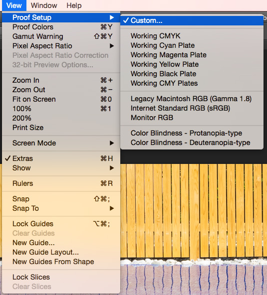
This is the image in PS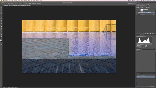 To set up Soft Proofing go View, Proof Setup, Custom
 This causes a window to pop up.
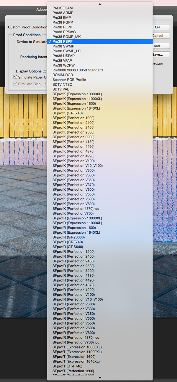
Select Intent Perceptual, Black Point Compensation, and Simulate Paper Colour. This is also where you need to select your Paper/Printer profile. I have chosen my Epson paper in my printer.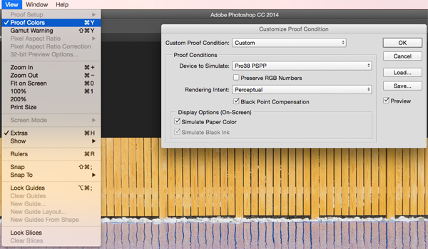 The full list is BIG
 You can now select Proof Colours (as shown above)
The colours change on your monitor in line with what PS calculates your printer will do (Note this just puts it closer not necessarily the same and it still relies upon you monitor being correctly profiled.)
I then introduced the two layers to try and put the colours back where I felt they should be.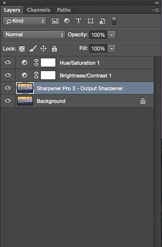 Having achieved this you can also click Gamut Warning. Any colours outside the capability of your printer paper combination will now be shown in grey.
The soft proofing only helps you judge what your print will look like. For example if your monitor covers less of the gamut than your printer it will not work fully.
This is the Lightroom equivalent from Paul Leighton. (Thanks)
There is a video HERE. 1. In the develop module switch on soft proofing or press S key (bottom of screen)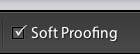 2. Select the paper to be printed on and switch on gamut warning top right of picture with white square box around it.
You will now see any colours which will not be printed correctly on the paper.
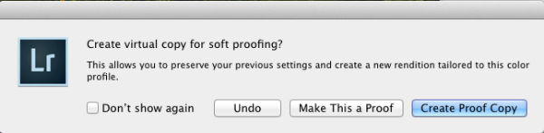
Lightroom will ask if you want to make a proof copy say yes because this will be used for the print only.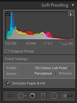
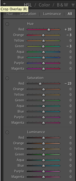
 3.Use the HSL/Colour sliders to adjust any out of gamut colours.
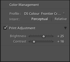
 4. When happy with the colours send to the print module for final adjustments.
 The Lightroom method indicates that you should ensure that all your colours are capable of fitting in the destination gamut.
In PS you can chose intent (Perceptual or Relative Colorimetric) to put out of gamut colours into gamut or using Gamut warning adjust colours in the same way as indicated in Lightroom.
I recently wanted to print an image where the bright colours were part of the impact of the image. I knew that a print would not be the same as seen on my screen.
I used Soft Proofing to see the degradation in contrast and weakening of the colours. I then used Brightness/Contrast and Hue/Saturation layers to adjust the image back to where I felt it should be with Soft Proofing enabled.
The following should help you to see the process.
This is the image in PS
Select Intent Perceptual, Black Point Compensation, and Simulate Paper Colour. This is also where you need to select your Paper/Printer profile. I have chosen my Epson paper in my printer.
The colours change on your monitor in line with what PS calculates your printer will do (Note this just puts it closer not necessarily the same and it still relies upon you monitor being correctly profiled.)
I then introduced the two layers to try and put the colours back where I felt they should be.
The soft proofing only helps you judge what your print will look like. For example if your monitor covers less of the gamut than your printer it will not work fully.
This is the Lightroom equivalent from Paul Leighton. (Thanks)
There is a video HERE. 1. In the develop module switch on soft proofing or press S key (bottom of screen)
You will now see any colours which will not be printed correctly on the paper.
Lightroom will ask if you want to make a proof copy say yes because this will be used for the print only.
In PS you can chose intent (Perceptual or Relative Colorimetric) to put out of gamut colours into gamut or using Gamut warning adjust colours in the same way as indicated in Lightroom.